Day 1: And So It Begins

My lengthy trip begins today with the short PHX to LAX segment before flying to Seoul tomorrow.

If you’re in Seoul, Beijing, Tokyo, Queenstown, Auckland, Sydney, Amsterdam, Munich, London, Manchester, Edinburgh, Stockholm, Dublin, Milan, or Paris, hopefully you can make it to one or more of the Dojo events (Dojo dinner/beer and workshops) or conferences along the way.

Dojo Shirts and Stickers are available as well:

Dojo Beer New York

Dojo on 6th Street in Austin

Dojo Workshops and Events

As part of my upcoming travels, I’ll be speaking at a number of events and conducting a few training courses as well. The highlights:

  • Dojo training course in Munich with the guys from uxebu in Munich on May 7th and 8th
  • Dojo training course in Stockholm at the Swedish Web Developer Conference on May 25th and 26th
  • QCon Beijing, QCon Tokyo, Web’09 (Auckland), SpringOne Europe (Amsterdam), WebTech eXchange (London)
  • Additional training courses tentatively planned for Sydney in late April and Milan and/or Paris in mid-June
  • Dojo social events in Phoenix, Seoul, Beijing, Tokyo, Queenstown, Auckland, Sydney, Amsterdam, Munich, London, Manchester, Edinburgh, Stockholm, Dublin, Milan, and Paris.

A full RSS feed of events is also available. If you are interested in sponsoring an event, hosting the Dojo workshops in Sydney or Paris at your office, or hosting your own dojo.beer event, please contact me for more details.

A while back, Steve Souders of YSlow and High Performance Web Sites fame asked me if I wanted to write a chapter for his new book, Even Faster Web Sites.

In general, I turn down all offers to write books because I’m very busy with SitePen and Dojo. That said, when Steve asked if I would write a short chapter on Comet performance, that seemed manageable and so I did. I only committed to doing so after writing the chapter, as I didn’t want to back out if I couldn’t put something together that was of sufficient quality. A few plane flights gave me the bulk of the time to write the text for the chapter.

Even Faster Web Sites is now available now for pre-order.

Around the World in 76 Days

I’ve wanted to take a trip around the world for most of my life.

When I was growing up, my Grandfather entered a contest to guess the total feet traveled of all Cubs home runs from the start of the season until a specific date. He turned in his contest entry, and after turning it in, he realized that he made an error in his calculations. It’s good that he made this error, because he won the contest to the exact foot. As a result, he threw out the first pitch on fan appreciation day, was interviewed on WGN during the game, and he won a trip around the world for him and my grandmother.

Fast forward many years, and I’m taking my first trip around the world. Through the confluence of many great tech conferences, clients in various countries, the opportunity to meet new people and business leads along the way, extremely cheap airfares and hotels (due to the economic downturn), the amazing worldwide Dojo Community, my Mom having the dream of finally going to Ireland, and the internet making it possible to be productive from anywhere in my line of work, I recently purchased a Star Alliance “Round the World” ticket and will soon embark on a 76 Day journey along this path:

  • Los Angeles
  • Seoul, South Korea
  • Beijing, China
  • Tokyo, Japan
  • Queenstown, New Zealand
  • Auckland, New Zealand
  • Sydney, Australia
  • Amsterdam, The Netherlands
  • Munich, Germany (and several other places in Germany, including the birthplace of my Grandfather)
  • London, England
  • Manchester, England
  • Edinburgh, Scotland
  • Glasgow, Scotland
  • Stockholm, Sweden
  • Galway/Shannon/Cork/Wexford, Ireland (my Mom is flying over for this segment of the trip, and we’re going to see where my Great Grandmother was born)
  • Dublin, Ireland
  • Milan, Italy
  • Paris, France
  • London, England (to fly home)

I had to make some difficult decisions about places to skip this trip… South America, India, Spain, Greece, Norway, Eastern Europe, Russia and others missed the cut this time.

I hope to get to meet as many SitePen clients and leads and Dojo users and contributors along the way as possible, while still saving sufficient time for work and sightseeing. I’m speaking at QCon China, QCon Japan, Web’09 (Auckland), SpringOne (Amsterdam), WebTech Exchange (London), and the Swedish Web Developer’s Conference 2009 (Stockholm). We’ll also be hosting a number of Dojo dinner/beer events along the way, and a few other events are still in the works, including a Dojo Community Day in Germany, and possibly a couple of Dojo workshops.

If I’m in your area, please let me know if you want to get together. If you have suggestions on places to have dinner, or things I must see along the way, please let me know. I’ll post more details and specific dates in the near future, but the trip is planned from late March to mid-June.

Cruel?

Is it cruel to send friends and co-workers living in colder climates pictures like this?

Warm in Arizona

It’s been a ridiculously warm winter this year, and unusually cold for the rest of the nation, and I find myself compelled to let our friends in Minnesota and Wisconsin know what they’re missing, such as a March 1st high of 89!

Two years ago, I wrote about Airline web sites and their use of JavaScript/Ajax toolkits. A lot has changed since then, so here’s an update. Two years ago, Southwest and JetBlue were the clear leaders in web site quality, ease of use, and also use of Ajax toolkits. Below is a quick, non-definitive review of airline web sites today. Note that I have reviewed the USA version of international airline web sites.

First Class

  • British Airways: Recent introduction of jQuery improves upon a site that for the most part just works as expected. Now, about those international first class prices…
  • Frontier: A good use of jQuery and jQuery UI to make common tasks easy and efficient. I’d suggest speeding up the animation/transition speeds of the date pickers a bit, but otherwise they’ve done a solid job with their new user experience.
  • JetBlue: Still a great web site, though the competition is closing in on them a bit. They make use of minimized versions of Prototype and YUI. I’m a bit at a loss for why they have 17 separate JavaScript requests at the top of their home page… I recommend their team grab the YSlow plug-in and a copy of High Performance Web Sites and reduce the number of HTTP connections.
  • Northwest: They have switched from YUI to jQuery + jQuery UI. The site looks great and works well, but they don’t seem to auto-complete city names or airport codes, instead requiring the use of a somewhat odd second window. This site is likely to go away once they are fully integrated with Delta.
  • Virgin America: They have the luxury of being a new airline with relatively few cities to serve. Their use of Prototype is decent, but their use of Flash for where they fly is annoying.
  • Virgin Blue: Great web site, makes use of Prototype and jQuery. Arguably the best airline web site, though I haven’t used it enough to put it to the full test.

Business Class

  • Air Canada: A lot of custom code and far too many HTTP requests, but the site looks decent and works effectively.
  • Air France: see Air Canada
  • American: Once the leader of all airline web sites, American has made subtle but useful improvements over the past couple of years, including the use of Prototype and DWR. The visual design of their site feels stuck in time.
  • bmi: I’ve rated them this high because they have made a lot of effort to experiment. They are using jQuery, but there is some serious lag with their animations and transitions, and their design feels inconsistent in places.
  • Delta: No major toolkit usage from what I can tell. A decent web site with no glaring flaws.
  • Emirates: Custom code, site is efficient and easy to use.
  • Japan Airlines: Comparable to Air Canada.
  • KLM: Northwest or Delta, without the Ajax toolkit.
  • Lufthasna: Efficient use of Dojo and Dijit. User experience could use some work, and you can’t select a seat assignment between the time you book and check-in time. Some weird encoding bugs when downloading some of their seat maps within Firefox.
  • SAS: Far too many HTTP requests for JavaScript and CSS, but a reasonable user experience overall.
  • Singapore Air: Their use of the venerable dyn-web was surprising, and their site is relatively basic, but everything works well. Their A380 Suite Class and Business Class in general makes it difficult to complain about their web site, but they really need a first class site to match their on-board experience.
  • Swiss Air: Comparable to Air Canada.
  • United: Their site looks ok and uses jQuery, but the process of picking a flight and seeing what seats are available in terribly inefficient. Just show me the prices and availability for all 3 classes when I want to pick a flight please. And while you’re at it, your entire upgrade process is over the top complex… take a lesson from US Airways on this one.
  • Virgin Atlantic: Some use of jQuery, but a notch below Virgin America’s web site.

Economy

  • Alaska: Use of some JavaScript that appears to be tightly coupled to their use of Asp.NET. Interaction and visual design are in need of a refresh.
  • Alitalia: Custom code, slow to load, but I was expecting worse.
  • All Nippon: Dreamweaver-generated JavaScript code and page layout. Nothing stands out as great or terrible.
  • Asiana: Use of Prototype is decent. They need to hire someone from the US to read the content and clean-up the translations. A number of nested pages return 404s for me.
  • Cathay Pacific: Custom code, and a very basic site with an outdated design.
  • China Air: Slightly better than Cathay Pacific, and far superior to Air China.
  • Continental Airlines: The worst of the US-based web sites that I’ve reviewed in this article.
  • easyJet: No toolkits, and not great code, but the site works better than expected.
  • Qantas: They use jQuery in small doses, but for example, their tab-like user interface is really a set of links to go to other pages on the site. Flash is used all over the site for advertising their deals: 6 flash objects alone on the page to book a flight.
  • US Airways: [Disclosure: I’m in the US Airways Chairman’s Club for people that fly way way way too much, so I use this web site more than all of the others reviewed combined]. Today’s site is an antiquated Asp.NET mess with frequent down time and a subpar design. They also have other problems related to experience: for example, if you buy a ticket anywhere else, it doesn’t show up in you upcoming itineraries when logged in, though it does show up when you enter your name and confirmation code. This is true even when your frequent flyer number is entered as part of your reservation on the third party site such as Expedia; otherwise they wouldn’t be able to upgrade you. So what keeps this site rated where it is? US Airways has the best domestic first class (well, really it is business class called first class) upgrade program in the industry, period. It’s simple, automatic, and rewards people that fly the most.

Lavatory

  • Aer Lingus: Bloody ugly and old school.
  • Air China: A dreadful user experience for their USA-facing web site. I just don’t understand the site at all.
  • Air New Zealand: Looks great, but horribly broken for me on Firefox 3. Their booking page was blank, and deals page showed a bunch of code making think I ran into issues during testing.
  • RyanAir: Makes my eyes bleed, just like the experience when flying them.

Summary

Airline web sites have improved significantly in the past two years, but have a long way to go. jQuery has replaced Prototype as the toolkit of choice for airlines, though I still believe Dojo would be a great choice for these sites. If you are an airline and want to get assistance with creating a great user experience, contact us at SitePen.

I make use of a number of other web sites including old stalwarts like Expedia, and four of my favorites: Kayak, TripIt, SeatGuru, and Trip Advisor, making life a lot easier for the frequent flyer.

I’m attending a number of Dojo social events in February and March:

February 4, 2009:
dojo.beer.dinner(“boston”)

February 17, 2009:
dojo.beer.dinner(“new york”) (to be announced later this week)

February 18, 2009:
Ajax Toolkit Panel (hosted by Google)

March 15, 2009:
5th Annual Dojo Salt Lick, Driftwood TX (near Austin) during SXSW (to be announced soon)

Two Additional Dojo Books

Our English language Dojo book total is now up to at least six, with more books on the way.

Peter Svensson has released Learning Dojo, which includes coverage of the new Dojo grid, and numerous DojoX examples. There’s an example chapter on Layout available for free.

Leslie Orchard has released the Concise Guide to Dojo. I do not yet know anything about this book, other than knowing that it is on the market and that it weighs in at exactly the same number of pages, 264, as Peter Svensson’s book!

This book follows on the heels of the first three Dojo books and the fourth Dojo book.

Thankful

On this day of thanks, on a professional level, I’m really thankful that Dojo is such a thriving community, and SitePen is able to work with such amazing and great companies.

A few people have asked me privately if I am upset that Alex is joining Google. The short answer is, absolutely not. Alex has been hacking on WebKit and Gears for a while now, and when we heard about Chrome, we thought it was a great way to make the open web better. I’m thankful that a company like Google dedicates so many resources to improving the open web. So while Alex is no longer at SitePen, I’m excited about the possibilities that exist with having even better browsers for building great apps for you.

On a personal level, I’m extremely thankful to have a great family, friends, and co-workers. I’ve also been fortunate to meet so many amazing people over the past few years as Dojo as evolved from small little project to tool of choice for hundreds of thousands of developers.

Adobe MAX 2008 Recap

I was invited to speak at Adobe MAX this year on the topic of Building Desktop Applications Powered by Dojo and Adobe AIR. The talk summarized the key things we’ve learned at SitePen in adding AIR support to Dojo, as well as working on the Dojo Toolbox and the Dojo Extensions for Adobe AIR. Full slides from the talk are now available:

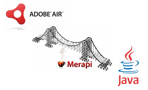
During the talk, I mentioned the frustrations we had with ShrinkSafe and not being able to execute Java code from AIR. After the talk, one of the attendees mentioned the Merapi project, which aims to build a bridge from AIR to Java, which looks like an interesting solution to our problem of needing a place to run Rhino within our Builder tool:

Merapi

Another audience member suggested we also look at a Java to ActionScript Converter. While likely not ideal for what we are doing, there’s an interesting push around the edges to solve our problem.

Aptana also showed off support for AIR debugging for Ajax Developers within Aptana Studio.

The talk of MAX so far is Flash Catalyst, a new approach to solving the tooling problem for interaction design. At this point, I have mixed feelings about the usefulness and approach of Catalyst.

At the keynote, there was a focus on a number of the great features of Flash 10, including:

  • 3-D cloth simulation with a video texture
  • 3-D analyzer triggered by the audio spectrum
  • Pixel Bender stuff brings After Effects type abilities
  • New Video component handles multiple streams and true bandwidth detection which seamlessly switches between different bit rates if a user consumes more or less bandwidth (e.g. connection or opening other windows/tabs/videos)
  • The multiple streams don’t have to be for multi-bit rate – they can also be used for playlists
  • Support for SMIL
  • Maria Shriver was there. We still don’t know why.
  • The new Flash text engine is also significantly improved. It handles nice ligatures and can mix international text with local text, and the ligatures in the same text box. Supports now exists for left to right rendering, and not only does text on a path, but with full animated support.

    Digital Audio Signal Processing in Flash 10 was a very popular session, and very informative, since the dynamic sound feature is under-documented. Basically, you extract the data from an MP3 file, or create synthesized sounds, and then you can manipulate the bits to add effects.

    At Sneaks, Adobe engineers showed off a number of experimental technologies being worked on today. The overall production quality of the demos was great, though the applause-o-meter used to judge the winning entries did not seem to actually work. Meer Meer was interesting, as well as some of the efforts towards object cropping in images. Adobe also introduced Durango for assembling mashups and widgets, which in some ways is like ProjectZero.

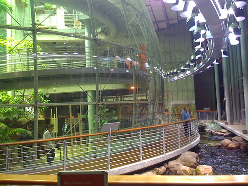
    After Sneaks, there was a great party at the recently reopened California Academy of Sciences. I hadn’t been there in more than 20 years, and it was a great venue for having a drink, entering a rain forest, walking underneath an aquarium, checking out a view of the city, playing foosball, and enjoying an eclectic variety of musical entertainment. Adobe threw a great party at an amazing venue.

    Adobe MAX party: Rainforest at California Academy of the Sciences

    Adobe MAX party: Band playing at the California Academy of the Sciences

    Finally, the introduction of 64-bit Flash for Linux was a great move as it is the first platform to receive a 64-bit version, rather than being a distant third to Mac and Windows. From what I can tell, this removes one of the last obstacles to getting AIR launched on Linux as well.

    Overall, the quality of the conference was great and had something to offer anyone interested in web development or web design. While there was the expected marketing slant towards Flash and Flex-based products, I appreciate Adobe inviting us to speak about SitePen and our work on open web technologies.

« Prev - Next »